
TUZHE PACKAGING GUIDE
Print on Kraft Paper Bags: Stock, Folds and Handles
Review kraft bag artwork on the selected paper and assembled shape. Check color references, small text, gusset folds and handle attachment before approving the print.
On this page
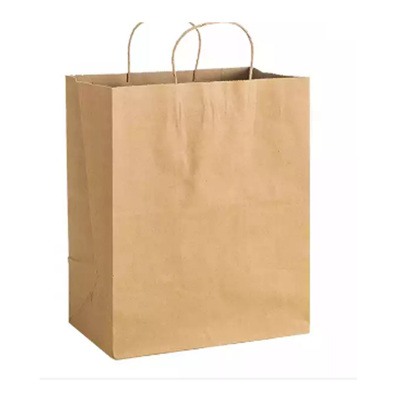
Kraft paper is part of the visual design, not simply a neutral background for a logo. The selected surface, folds and handle attachment all influence how the finished bag reads. Review the artwork on the specified construction before extending it across a range of sizes.
Make the paper sample part of the artwork reference
Ask which paper surface the proposed print will use and keep that reference with the artwork file. A screen preview does not reproduce the physical paper or show how every finish will appear. Where color consistency matters, agree on a suitable physical reference or production proof.
Distinguish the desired brand color from the agreed way it will be produced on the selected stock. Do not let the same word, such as “brown,” stand for several different paper samples. If the paper changes, consider which appearance decisions need to be reviewed again.
Separate graphics that attract attention from text that must be read
A large mark may remain recognizable where fine text becomes difficult to read. Review the smallest important wording at the size it will actually appear on the bag. Check reversed text, narrow strokes and boundaries between printed areas on the physical proof appropriate to the project.
Keep essential identity information on a face that is visible when the bag is loaded and carried. A layout centered on the flat blank may move off-center in the assembled view. Judge that view with representative contents inside.
Use the folds as design boundaries
Mark gusset folds, the base turn-in and the closure area on the final dieline. Decide deliberately which graphics continue across them and which should stay within one panel. A fold can hide part of a sentence or split a small logo even when the artwork file looks balanced.
For kraft bags with twisted paper handles, inspect the relationship between graphics and the handle attachment. With ribbon-handle gift bags, include the ribbon and attachment positions in the assembled review rather than treating them as an afterthought.
Do not scale one layout blindly
A smaller bag may have different panel proportions, not just reduced dimensions. Recheck the logo position, contact text and clear space on every dieline in the range. The same visual hierarchy can be preserved with different placements.
Give each size its own artwork reference. A simple proof checklist can record the paper, bag size, visible face, smallest text and handle clearance, then link the result to the accepted file.
Keep carrying performance in a separate review
Approving the appearance does not establish a load rating. Confirm the bag dimensions and handle construction through the intended carrying trial described in the paper-bag measurement guide. This keeps a successful print proof from becoming an accidental approval of the entire pack.
Include the paper reference and proof requirements in the custom packaging brief before asking for a final quotation. The supplier can then respond to a defined appearance rather than a screen color alone.