
TUZHE PACKAGING GUIDE
Gift Packaging Design: From Contents Plan to Final Artwork
Develop a gift-packaging concept in the right order: contents, opening, insert and artwork. Keep visual references and production requirements aligned as the design evolves.
On this page
A gift-packaging concept becomes easier to develop when its contents and opening sequence are settled before the outer graphics. Otherwise the design may look finished while the box size, insert and print panels are still changing. Build the visual presentation on a structure that has a clear job.
Write a short design intention
Explain what the recipient should notice first and how the pack will be presented. A countertop gift, a hand-carried bakery set and a mailed assortment may have different priorities. Choose a few concrete objectives, such as a visible main item, a discreet card compartment or a straightforward opening movement.
Keep mood images separate from requirements. A reference may communicate color or atmosphere without defining the supplied material, construction or finish. Label the feature you want to borrow instead of asking the supplier to infer the entire specification from a photograph.
Draw the contents plan at a useful scale
Arrange the actual items or dimensioned representations. Include inserts, cards and accessories that occupy space. Identify where the recipient reaches into the pack and which item leaves first. The insert retention and removal guide helps develop that interior.
Once the arrangement is plausible, compare closure options in the gift-box collection. A removable lid, ribbon closure and magnetic flap create different opening gestures. Choose one because it supports the presentation and packing routine, not merely because it appears in a fashionable reference.
Assign a role to each visible surface
Decide which face introduces the brand, which explains the set and which carries practical information. Inspect the closed box, the opening moment and the interior reveal. Repeating the same large logo on every surface can compete with the contents rather than helping the recipient understand the set.
Use the finalized dieline for artwork placement. Keep important text away from folds or concealed overlaps unless that placement is deliberate and has been reviewed on the assembled package. The smallest panel often needs its own layout rather than a compressed copy of the lid.
Review finishes in the setting where they matter
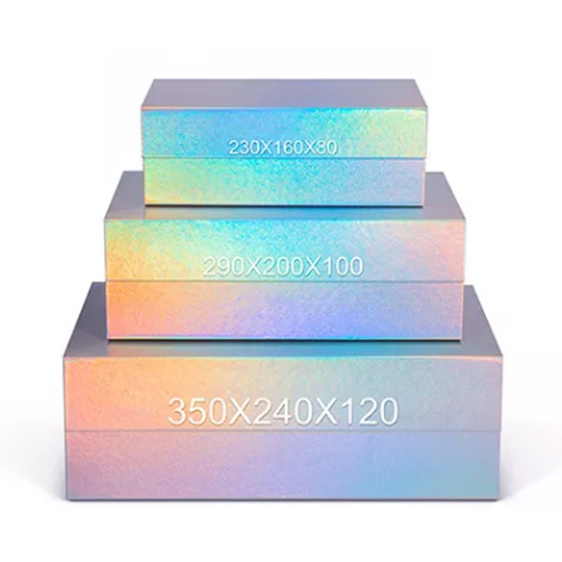
A reflective, textured or iridescent effect can change as the viewing angle and light change. Use an agreed physical sample when that effect is important to the concept. Check whether the text remains readable and whether the desired contrast survives the actual finish.
Iridescent magnetic gift boxes and ribbon presentation boxes illustrate different visual directions. The photographed treatment is a starting point for discussion; it does not define the exact finish, color or accessories in a custom order.
Close the concept with a coordinated set of files
Bring the contents layout, structural drawing, artwork revision and accessory list into one review. If a card grows or an insert changes, check whether the interior and outer dimensions still agree. Small presentation decisions can alter the package that must be supplied.
Use separate structure and artwork approvals to record the final outcome. A persuasive concept becomes a usable production brief only when the selected references describe the same version.